
I acknowledge the Ngunnawal people, the traditional owners of these lands, and pay respects to all First Nations people present.
I’m pleased to join you today, in the tenth year of the annual Australian Government Data Summit. Robust, rigorous data and statistics are vital for delivering outcomes for all Australians.
Throughout our nation’s history, Australia’s statisticians and statistical agencies have punched above their weight in this – or should I say, found themselves in the right tail of the distribution. The nation’s first statistician, George Knibbs (known to his friends as ‘The Knibb’) published papers on mathematics, geodesy, wealth, and population. He was an acting professor of physics at the University of Sydney. He published a book on the federal capital. He was a member of the British Astronomical Society. He even wrote a book of verse.
George Knibbs must have been intimidating to many, but as one biographer notes, he had a ‘reputed charm of manner and unvarying kindness of heart’ (Bambrick, 1983). He would talk in a high‑pitched voice about his wide‑ranging interests, prompting one observer to note that ‘an hour's conversation with him is a paralysing revelation’. Whether this is a compliment or an insult is hard to tell, but regardless – you will be glad to know that I do not intend to regale you for the next hour. No paralysing revelations from me.
Instead, my focus today is on the surprising and important ways that artificial intelligence and big data are being used in government. Then, in the spirit of The Knibb’s verse‑writing, I will finish with a data‑crunching exercise of my own.
ABS: big data and artificial intelligence
Modern statisticians are using analytical tools and data collection methods that The Knibb could hardly imagine. The Australian Bureau of Statistics is living and breathing the big data and artificial intelligence revolution.
ABS analysts are at the forefront of methodological innovation, helping to improve our understanding of the Australian economy and labour market.
Take the example of the ABS using generative AI to help update the Australian and New Zealand Standard Classification of Occupations.
ANZSCO is a vital data set for understanding the nature of the labour market. It catalogues and categorises all occupations based on skills in Australia and New Zealand. Created in 2006, it now covers 1,076 occupations, from Acupuncturists, Blacksmiths and Cartographers to Wool Classers, Youth Workers and Zookeepers (Commonwealth of Australia, 2022).
Over time, occupations change. Just as ANZSCO 2006 updated prior occupational coding systems in Australia and New Zealand, it eventually needed an update. Bringing it up to date in 2024 was set to be a significant task. Just think about making a discrete list of the key tasks in your job and multiply that by more than a thousand jobs across the economy.
That’s why the ABS looked to AI for help to create a preliminary list of tasks undertaken in each occupation.
ABS data scientists gave ChatGPT a comprehensive prompt of over 480 words based on the existing publicly‑available ANZSCO. This helped the AI to generate its output in the right format and style.
ABS analysts spent time testing and refining ‘the prompt’ – or the question they ask ChatGPT – so that the machine delivered what the humans needed.
After each test, the analysts used a mathematical formula to calculate the quality of the responses within tolerance levels around precision and recall.
The ABS data scientists iterated the prompt until it consistently produced a high‑quality output. The final prompt ended up optimising the output from ChatGPT to about 69 per cent for both precision and recall.
The results were of such high quality that in one test, ANZSCO analysts themselves were asked to distinguish between the description of occupational tasks written by analysts and those written by generative AI. Two‑thirds got it wrong.
The results from ChatGPT were not perfect. But they did provide enough of a starting point for ABS analysts to review and build on. As a result, the project team saved approximately 1,600 hours. It amounted to an approximate seven‑fold return on investment.
Throughout, ABS data scientists were clear about the purpose of the exercise – to use generative AI to support – not replace – human analysts. All outputs were evaluated against four criteria: quality; ethics; legality; and security. This meant that AI outputs were correct, maintained privacy, did not break intellectual property laws and vitally, maintained the place of humans at the centre of decision‑making.
This delivers on our government’s commitment to fostering an innovative culture in the Australian Public Service, while managing the risks of emerging technologies.
This low‑risk project is a promising example of how generative AI can be applied in national statistics, enhance productivity, and develop related skills and capabilities in safe and responsible ways. It will help to pave the way for further ABS adoption of AI technologies.
The ABS is also at the forefront of harnessing digital technologies to build high quality, big data sets. By collecting weekly supermarket scanner data from private companies, the ABS is able to gather granular insights about household inflation and understand how the economy is tracking.
This is big data. For a moment, close your eyes and try to imagine all the items in Australia which were scanned at major supermarket checkouts over the past week. If it helps, remember that the typical major supermarket stocks over 15,000 different products, that there are over 10 million households in Australia, and that the typical household shops more than once a week.
Well, each of those items scanned last week – including the product purchased, quantity purchased, dollar value and location of purchase – is logged in this big data set. The ABS has been collecting this weekly data since 2011, so you can only imagine the size of it.
Through this data provision arrangement between private business and the ABS, 84 per cent of food sales from supermarkets and grocery stores is captured. The scale of this data allows for a granular understanding of household consumption, which is essential for compiling estimates of the Consumer Price Index.
The ABS is continuing its work to modernise collection methods to gather high quality and granular household spending data.
Traditionally, the ABS has collected detailed data by sending survey forms to households and asking them to record every good and service they purchase in a 2‑week period (using a 28‑page physical diary). This process is expensive, and response rates are falling. The next expenditure survey will utilise a digital diary – much like an app – which will work on any electronic device. This will greatly reduce costs and burden as well as streamline data processing.
Case study: big data and electoral results
Finally, I promised you a data‑crunching exercise of my own. I will show how analysing big data sets with novel techniques can reveal surprising insights. In this case, I have drawn my inspiration from political psychology.
In 2012, New York University’s Bernd Beber and Alexandra Scacco published a seminal paper that analysed the numbers in electoral results for various countries. Their starting point was that humans are surprisingly bad at making up numbers. When asked to create random numbers, participants have been shown to favour some numerals over others. Numbers ending in zero do not feel random to us, so less than one‑tenth of made‑up numbers end in zero. Falsified numbers are more likely to end in 1 and 2 than in 8 and 9.
Using this insight, the researchers look at the last digit of vote counts in various elections – both in Scandinavia and in Africa. They find that vote counts in the 2002 Swedish election have last numbers that are evenly distributed from zero to nine. By contrast, in elections held in Nigeria in 2003 and Senegal in 2007, they find anomalous patterns of last digits (Beber and Scacco, 2012). Many other researchers have used the tools of forensic electoral analysis, applying them to modern‑day elections where fraud has been alleged (Deckert, Myagkov and Ordeshook, 2011; Pericchi and Torres, 2011; Tunmibi and Olatokun, 2021; Figueiredo Filho, Silva and Carvalho, 2022).
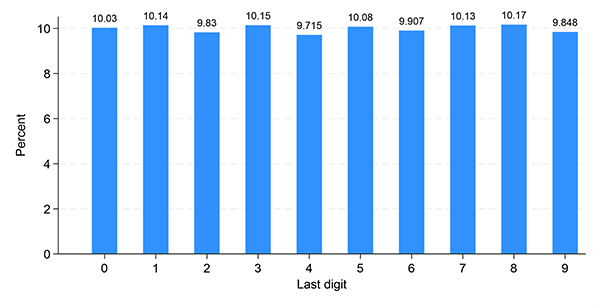
Using this same approach, we can look at Australian elections, starting with the 2022 poll. Figure 1 shows the distribution of last digits in candidates’ vote counts across polling places. Naturally, when vote counts are small, the last digit tends to be lower, so I exclude results where a candidate received 100 or fewer votes. That leaves 21,822 results. You will be reassured to know that they show a refreshingly uniform pattern. The least common final digit is 4, which appears 9.7 per cent of the time, and the most common final digit is 8, which appears 10.2 per cent of the time.
Now, let’s take a look at a place where we might expect to see more shenanigans.
The 1843 Legislative Council election in New South Wales was the first of its kind. Only men who owned land worth more than £200 or more (or who rented a dwelling for £20 or more a year) were permitted to vote. According to the National Museum of Australia, these elections were ‘rough and tumble exercises… Alcohol, bribery, coercion and violence were intrinsic to the process’ (National Museum of Australia, 2024). Men were shot, and the Irish journalist William Kelly described early colonial polls as ‘nothing more or less than pantomime in a frenzy’.
What can we say about the voting patterns in these early elections? Because there were relatively few contests, we cannot analyse them one at a time. Instead, I tabulated data for the first 16 New South Wales colonial elections, from 1843 to 1887. I include both Legislative Council and Legislative Assembly elections, as well as by‑elections. Dropping contests in which candidates received 100 votes or fewer leaves 1,835 results. The distribution of the last digits is shown in Figure 2.
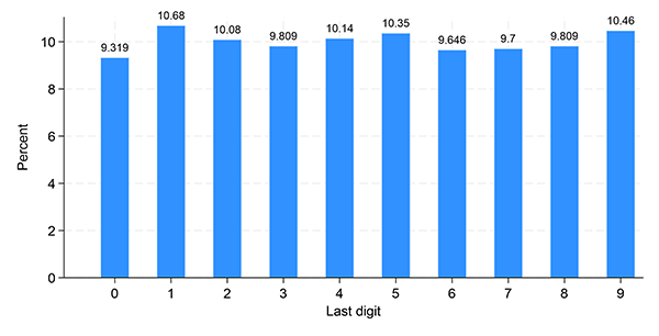
With fewer races in the dataset, we should expect a bit more statistical noise, but the races do not show marked evidence of fraud. The least common last digit is zero, which appears 9.3 per cent of the time, while the most common is one, which appears 10.7 per cent of the time. You might raise an eyebrow at this difference, but you should probably not raise both of them.[1]
Conclusion
The current revolutions in AI and big data in national statistics are not simply good just because they use new, cutting‑edge technologies. They matter because they offer the Australian Government a way of improving our administrative practices, and therefore the way we deliver for all citizens.
As I have explored through the examples of innovative work at the ABS, AI and big data can help to structure and collect data productively, safely and responsibly.
And as my election data‑crunching exercise shows, we can use novel techniques and frameworks to analyse big data sets to discover surprising patterns. The fields of cyber forensics, forensic economics and forensic accounting are deploying sophisticated tools to identify and reduce fraud and cheating.
Big data and generative AI offer opportunities across government to deliver superior outcomes for Australians. Our government remains committed to exploring these technologies within a clear ethical framework. As The Knibb knew a century ago: better data allows us to better serve the nation.
References
Australian Bureau of Statistics (2022), ANZSCO – Australian and New Zealand Standard Classification of Occupations, 2022 Australian Update.
Bambrick S (2006) 'Sir George Handley Knibbs (1858–1929)', Australian Dictionary of Biography, accessed 24 February 2024. Originally published in the Australian Dictionary of Biography, Volume 9 , 1983.
Beber B and Scacco A (2012) 'What the Numbers Say: A Digit‑Based Test for Election Fraud', Political Analysis, 20(2), pp.211–234.
Deckert J, Myagkov M and Ordeshook PC (2011) 'Benford’s Law and the Detection of Election Fraud', Political Analysis, 19(3), pp. 245–268.
Figueiredo Filho D, Silva L and Carvalho E (2022) 'The forensics of fraud: Evidence from the 2018 Brazilian presidential election', Forensic Science International: Synergy, 5, p.100286.
National Museum of Australia (2024) 'Secret ballot introduced', accessed 24 February 2024.
Pericchi L and Torres D (2011) 'Quick Anomaly Detection by the Newcomb—Benford Law, with Applications to Electoral Processes Data from the USA, Puerto Rico and Venezuela', Statistical Science, [online] 26(4), pp.502–516, accessed 22 March 2024.
Tunmibi S and Olatokun W (2021) 'Application of digits based test to analyse presidential election data in Nigeria', Commonwealth & Comparative Politics, 59(1), pp.1–24.
[1] Formal chi‑square tests of the distributions in Figures 1 and 2 do not reject the null hypothesis that the last digits are uniformly distributed.
* My thanks to the Parliamentary Library’s Christopher Guiliano and my staff members Bria Larkspur, Maria Angella Fernando, Georgia Thompson and Maria Neill for assistance with data‑crunching, and to Antony Green for his original tabulations of NSW colonial election results. Frances Kitt provided valuable drafting assistance.
Text descriptions
Text description of Figure 1
This chart displays the frequency distribution of the last digits from 0 to 9 of vote counts, aiming to show uniformity as expected in genuine data. The percentages range from 9.7 per cent to 10.2 per cent, suggesting a uniform distribution without significant anomalies. This analysis is part of a presentation on the application of big data in monitoring election integrity.
Text description of Figure 2
Similar to Figure 1, this graph presents the frequency of the last digits from 0 to 9 in historic vote counts. The percentages range from 9.3 per cent to 10.7 per cent, indicating a relatively uniform distribution, though with more variation than in Figure 1. This analysis is part of a presentation on the application of big data in monitoring election integrity.