
I acknowledge the Ngunnawal people on whose lands we're meeting today and acknowledge all First Nations people present.
I am delighted to be here with you this morning to address the 68th Annual Conference of the Australasian Agricultural and Resource Economics Society. Founded in 1957, the Society has a long history of supporting economists and social scientists in Australasia to develop the knowledge and networks to tackle key challenges in applied economics, from agriculture to environment, to food, resources and agribusiness.
It's a pleasure to be back on the Australian National University campus for today’s conference. Not since 2010 have I been an economics professor, but I occasionally get to play one on stage. As you’ll soon see, I’ve leaned into that role today. Thank you for giving me the chance to crunch some data for your edification and entertainment. I haven’t written many economics papers that touch on agricultural issues, so I like to think that my teachers at James Ruse Agricultural High School would appreciate me finally putting my schooling to good use.
One of the pleasures of being an economist is analysing real‑world problems. Yet the tools and techniques for conducting applied economic research are changing fast.
Today, I want to briefly discuss some of the opportunities and challenges that machine‑learning algorithms present for applied economic research, and how those show up when we use them seeking to analyse the world.
This is vital because how we conduct economic research will drive our responses to critical issues confronting the Australasian and global community, such as biosecurity, climate change, environmental degradation and energy system transitions.
The rise of Large Language Models
Economic researchers have Large Language Models, such as ChatGPT, Bard, Claude and LLaMA, at their fingertips.
They are powerful AI systems which can generate and synthesise text at the tap of a button. They are trained on vast data sets. They are geared to respond to human instructions and deliver the outputs that humans need.
My favourite example of how AI can boost productivity comes from a large randomised trial involving 758 BCG management consultants (7 per cent of the company’s global workforce), carried out by Fabrizio Dell’Acqua and coauthors (Dell'Acqua et al 2023). The researchers asked consultants to do various tasks for a fictional shoe company. There were creative tasks (“Propose at least 10 ideas for a new shoe targeting an underserved market or sport.”), analytical tasks (“Segment the footwear industry market based on users.”), writing and marketing tasks (“Draft a press release marketing copy for your product.”), and persuasiveness tasks (“Pen an inspirational memo to employees detailing why your product would outshine competitors.”).
Half the consultants were asked to do the tasks as normal, while the other half were asked to use ChatGPT. Those who were randomly selected to use artificial intelligence were not just better – they were massively better. Consultants using AI completed tasks 25 per cent faster, and produced results that were 40 per cent higher quality. That’s like the kind of difference you might expect to see between a new hire and an experienced staff member.
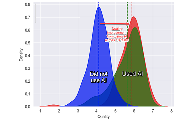
The researchers found that AI was a skill leveller. Those who scored lowest when their skills were assessed at the start of the experiment experienced the greatest gains when using AI. Top performers benefited too, but not by as much. The researchers also found instances in which they deliberately gave tasks to participants that were beyond the frontiers of artificial intelligence. In those instances, people who were randomly selected to use AI performed worse – a phenomenon that the researchers dubbed ‘falling asleep at the wheel’.
Economics researchers can also stand to benefit from the productivity dividends of Large Language Models. In an insightful survey paper on using AI for economic research, Anton Korinek notes that AI can be especially useful for economics researchers at tasks such as synthesizing, editing and evaluating text, generating catchy titles and headlines and promotional tweets. AI models are also useful in coding, particularly translating code, and in key steps in data analysis, such as extracting data from text and reformatting data (Korinek 2023).
In other tasks, artificial intelligence models can also be useful and help to save time, although do require more active oversight. Such tasks include providing feedback on text, offering counterarguments, setting up mathematical models, explaining concepts and debugging code (Korinek 2023).
In other economic research tasks, using LLMs still requires significant oversight. These include deriving equations and literature research (Korinek 2023). If you’ve used artificial intelligence to generate academic citations, you’ll know the problem here. The current models do not know that an academic citation is a single thing. So it hallucinates, generating made‑up citations with believable authors, titles and journal articles, and then adding randomly generated volume and page numbers. It doesn’t just do this for some references – it does it for all references. This will of course change in coming years as the models evolve. But for now, it’s a case of caveat oeconomista.
As Korinek suggests: “A useful model for interacting with LLMs is to treat them like an intern who is highly motivated, eager to help, and smart in specific domains, but who has just walked into the job, lacks the context of what you are doing, and is prone to certain types of errors.”
However, if you’ve just starting using them, the current AI models are the worst you’ll ever encounter. Coming models will use more computing power and larger training datasets. One indicator of the scale of resources flowing into the sector is that in 2023, venture‑capital investors put over US$36 billion into generative AI, more than twice as much as the previous year (Scriven 2023).
The trouble with talking about artificial intelligence and productivity is that the discussion can quickly turn vague. What do we mean by using a large language model? How precisely does it improve productivity? What exactly does it help us do better? If you haven’t been using an AI model on your computer or smartphone, then it may not be obvious how they can help you do your job better.
So rather than regaling you with high‑level studies, I decided that I would take a different tack. As an economist speaking to an agricultural economics conference, I thought that the best way of making my point might be to actually demonstrate what the tools can do. Budding writers are often given the advice “don’t tell it, show it”. So that’s what I’m going to do for you today. The specifics of the example don’t matter – what I’m aiming to do is to show how AI can be deployed to produce better, faster work.
Artificial Intelligence data analysis in action
So, let's see what the models can do.
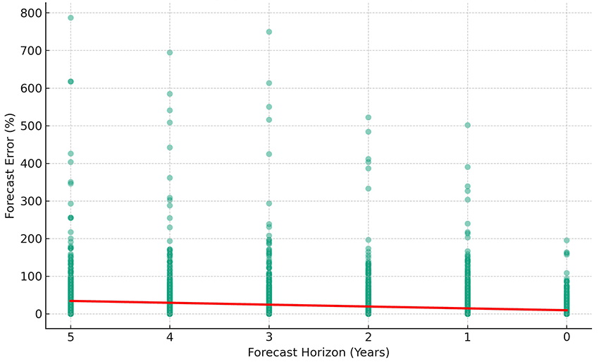
To start, I logged on to the ABARES site, and downloaded the Historical Agricultural Forecast Database. If you haven’t played around with it before, this is an impressive database, containing tens of thousands of forecasts for different agricultural commodities. I uploaded it into ChatGPT4, and asked it to describe the dataset. It read the data directory and data pages together, quickly told me in plain English what each variable was, and pointed out a few notable features of the dataset, such as the fact that forecast years range from 2000 to 2022, and wheat is the most common commodity forecast.
Providing my commands in plain English, I asked it to drop forecasts for sub‑regions, and create variables for the percentage error in the forecast and the forecast horizon. Then I asked it to plot forecast errors against the forecast horizon. This scatterplot, based on 14,622 observations, shows that forecasts get better as the year approaches.
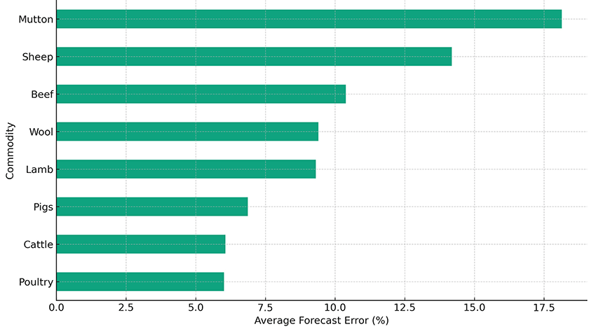
Now let’s see how the forecasts compare across commodities. To keep things simple, I’ll focus from this point onwards only on forecasts that are made for the next year.
Here’s the livestock forecasts, which range from an 18 per cent error in mutton forecasts to a 6 per cent error in poultry forecasts. Note that this chart was produced using regular language, not by coding.
So poultry forecasters are more accurate than mutton forecasters. Perhaps you might forget that fact. So let’s ask ChatGPT to make a digital art image that helps it stick in your mind.
AI-generated image
Now, let’s look at crop forecasts. One thing that I didn’t mention earlier is that when I asked ChatGPT to do graphs for crops and livestock, I didn’t tell it which was which. I left it to the AI to figure out whether poultry was crop or livestock. Basically, it got it right.
So there’s those crop forecasts.
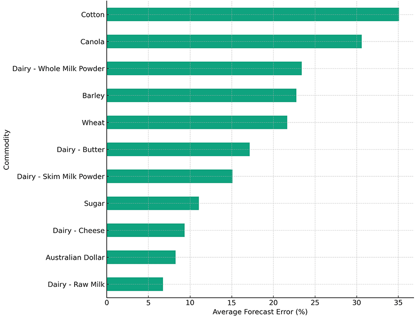
As you can see, the average errors for crops tend to be larger than for livestock. For example, average error in one‑year ahead cotton forecasts is around 35 per cent. You’ll also see that ChatGPT has decided that dairy is a crop, as is the Australian dollar. But let’s roll with it. The graph shows that forecasts for raw milk have an average forecast error of just 6 per cent.
Would you like a way to remember that dairy forecasts are more accurate than cotton forecasts? Here’s an AI image, generated in the style of anime.

AI-generated image
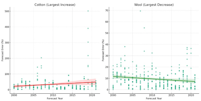
How are forecasts changing over time? One of the things that AI does especially well is to run the same analysis repeatedly for different subsets of the data. So I asked it to look at each commodity in turn, and see which set of forecasts showed the greatest improvement over time, and which showed the largest deterioration. I then asked it to draw two graphs – one showing the commodity where forecasts are getting better at the most rapid rate, and the other showing the commodity where forecasts are deteriorating most rapidly.
As you can see from the graph, forecast errors for cotton are getting bigger, while forecast errors for wool are getting smaller. Since bigger errors are bad, that suggests that cotton forecasts are going downhill, while wool forecasts are improving.
You might easily forget that result, so here’s another AI graphic to summarise the trend analysis.
Poor cotton.

AI-generated image
Conclusion
What can we learn from this cute exercise? First, artificial intelligence can be helpful at all stages of the research process. The models are quick to understand the features of a dataset, and easy to program.
Second, artificial intelligence doesn’t take away the need for a bit of training. When I first looked at the forecast dataset, I asked the engine to simply tell me the interesting patterns that it saw. It knew that the forecast variables and the actual variables were related, but it didn’t immediately figure out that it needed to look at the absolute percentage difference to have a meaningful benchmark. It was also happy to combine forecasts from different time horizons, making comparisons across commodities meaningless. Because my analysis took only a few hours, there are probably other coding errors that I’ve made, which an experienced user of the database would miss. AI is no substitute for knowing the data, and understanding the kind of exercise you’re trying to perform.
Third, artificial intelligence is great at graphs. When I’m coding in Stata, I need to specify every detail of the labels and style of the graphs. By contrast, ChatGPT often made judgment calls that accorded with what seemed most reasonable. Its graphs popped out quickly and were almost ready to insert into a presentation.
Fourth, artificial intelligence makes it easy to look at different aspects of the data. One of the skills of a good applied economist is to know your data and the patterns within it. By making analysis quicker, the researcher can spend more time understanding quirks and relationships that might have been missed.
For researchers, artificial intelligence has the potential to democratise data analysis, allowing anyone to delve into the world of statistics. Just as translation apps make it easier to travel to places where locals don’t speak your language, so too data analytics now no longer requires knowing how to code in a particular statistical language. From data analysts to digital artists, AI is reshaping our world.
References
Dell'Acqua F, McFowland E, Mollick ER, Lifshitz‑Assaf H, Kellogg K, Rajendran S, Krayer L, Candelon F and Lakhani KR (2023) ‘Navigating the jagged technological frontier: Field experimental evidence of the effects of AI on knowledge worker productivity and quality’, Harvard Business School Technology & Operations Mgt. Unit Working Paper, (24–013).
Korinek A (2023) ‘Generative AI for Economic Research: Use Cases and Implications for Economists’, Journal of Economic Literature, 61(4):1281–1317.
Scriven G (13 November 2023) ‘Generative AI will go mainstream in 2024’, The Economist.
Text descriptions
Text description of Figure 1
The image is a graph comparing two distributions of 'Quality', one for tasks completed without using AI, and the other for tasks completed with the use of AI. The horizontal axis is labeled 'Quality' and ranges from 1 to 8, while the vertical axis is labeled 'Density' and ranges from 0 to 0.8.
There are two bell-shaped curves on the graph. The curve on the left represents tasks done without AI and is colored blue, while the curve on the right represents tasks done with AI and is colored green. Each curve is peaked towards the middle of their range and taper off towards the ends, typical of a normal distribution.
A dashed vertical line extends from the peak of each curve downwards to the 'Quality' axis. The blue curve peaks at a 'Quality' value of around 3, and the green curve peaks at around 6.5, indicating a higher quality outcome when AI is used.
A red arrow spans the distance between the peaks of the two curves, pointing from the peak of the blue curve to the peak of the green curve. A label on this arrow reads "Quality improvement from using AI across 18 tasks," suggesting that the use of AI has improved the quality of outcomes.
The area under the curves represents the density or the proportion of tasks that fall at each quality level. The area under the blue curve is mostly between 'Quality' values of 2 to 4, while the area under the green curve is spread between 5 to 8. This implies that the use of AI has shifted the quality distribution towards higher values.
Below each curve, text labels indicate "Did not use AI" under the blue curve and "Used AI" under the green curve, further emphasizing the comparison between the two scenarios. The overall message of the graph is that the use of AI has a significant positive impact on the quality of completed tasks.
Text description of Figure 2
This image is a scatter plot graph titled "Forecast Error (%) vs. Forecast Horizon (Reversed Scale)". The horizontal axis represents the Forecast Horizon in years with a reversed scale starting from 5 on the left to 0 on the right. The vertical axis represents the Forecast Error in percentage, ranging from 0 to 800%.
The graph shows individual data points scattered vertically across different forecast horizons. There are clusters of points at each integer value along the Forecast Horizon axis. As the forecast horizon decreases (moving from left to right), the concentration of points tends to decrease. The points represent the percentage error in forecasting, with many points at lower forecast horizons clustered near the 0% line, but as the horizon increases, the spread of error percentages becomes greater, with some points reaching as high as 800%.
A red line at the 0% mark on the Forecast Error axis spans the entire length of the graph, serving as a reference point to visually emphasize the deviation of the forecast errors from 0%.
Overall, the graph suggests that as the forecast horizon becomes shorter (closer to the present), the forecast error tends to be lower, while longer forecast horizons are associated with higher variability and potential for greater error.
Text description of Figure 3
This image is a horizontal bar chart titled "Average Forecast Error (%) by Commodity for Horizon = 1 Year (Selected Livestock Only)". The chart is designed to compare the average forecast error percentages of various livestock commodities over a forecast horizon of one year.
The vertical axis on the left side lists different types of livestock commodities in descending order. Starting from the top, the commodities are: Mutton, Sheep, Beef, Wool, Lamb, Pigs, Cattle, and Poultry at the bottom.
The horizontal axis at the bottom represents the average forecast error percentage, ranging from 0% to 17.5%. Each commodity has a corresponding horizontal bar extending rightward from the vertical axis to indicate the average forecast error for that commodity.
The lengths of the bars vary, showing different levels of forecast error for each commodity. The longest bar represents Mutton, which extends to just over 17.5%, suggesting a high forecast error. Sheep and Beef also have relatively long bars, indicating higher forecast errors compared to others. On the shorter end, Poultry has the shortest bar, indicating the lowest forecast error among the listed commodities, with a value of just under 2.5%.
The chart uses shades of green for the bars and has a grid background to help visually distinguish the different levels of percentage error. Overall, the chart provides a clear graphical representation of the forecast accuracy for different livestock commodities, with longer bars representing higher errors and shorter bars representing lower errors.
Text description of Figure 4
This image is a horizontal bar chart titled "Average Forecast Error (%) by Commodity for Horizon = 1 Year (Crop Commodities Excluded)". The chart is designed to compare the average forecast error percentages of various commodities over a forecast horizon of one year.
The vertical axis on the left side lists different commodities in descending order. Starting from the top, the commodities are: Cotton, Canola, Dairy - Whole Milk Powder, Barley, Wheat, Dairy - Butter, Dairy - Skim Milk Powder, Sugar, Dairy - Cheese, Australian Dollar, and Dairy - Raw Milk at the bottom.
The horizontal axis at the bottom represents the average forecast error percentage, ranging from 0% to 35%. Each commodity has a corresponding horizontal bar extending rightward from the vertical axis to indicate the average forecast error for that commodity.
The lengths of the bars vary, showing different levels of forecast error for each commodity. The longest bar represents Cotton, which extends close to the 35% mark, suggesting a high forecast error. Wheat and Dairy - Whole Milk Powder also have relatively long bars, indicating higher forecast errors compared to others. On the shorter end, Dairy - Raw Milk has the shortest bar, indicating the lowest forecast error among the listed commodities, with a value of less than 5%.
The chart uses shades of green for the bars and has a grid background to help visually distinguish the different levels of percentage error. Overall, the chart provides a clear graphical representation of the forecast accuracy for different commodities, with longer bars representing higher errors and shorter bars representing lower errors.
Text description of Figure 5
This image consists of two scatter plot graphs – the first is titled "Cotton (Largest Increase)” and the second is titled “Wool (Largest Decrease)”.
The horizontal axis represents the Forecast Year with a scale starting from 2000 on the left to 2020 on the right. The vertical axis on the Cotton (Largest Increase) graph represents the Forecast Error in percentage, ranging from 0 to 500%. The vertical axis on the Wool (Largest Decrease) graph represents the Forecast Error in percentage, ranging from 0 to 70%.
Both graphs show individual data points scattered vertically across different forecast horizons. There are clusters of points at each integer value along the Forecast Horizon axis.
The points on the Cotton (Largest Increase) graph are concentrated below 100%, as the forecast horizon decreases (moving from left to right), the concentration of points tends to decrease. The points represent the percentage error in forecasting, with many points at lower forecast horizons clustered near the 0% line, but as the horizon increases, the spread of error percentages becomes greater, with some points reaching as high as 500%.
A red line at the 0% mark on the Forecast Error axis spans the entire length of the graph, serving as a reference point to visually emphasize the increase in forecast errors.
Overall, the Cotton (Largest Increase) suggests that forecast errors have increased.
The points on the Wool (Largest Decrease) graph are spread more evenly, with most below 30%, as the forecast horizon decreases (moving from left to right), the concentration of points tends to increase.
A green line at the 10% mark on the Forecast Error axis spans the entire length of the graph, serving as a reference point to visually emphasize the decrease in forecast errors.
Overall, the Wool (Largest Decrease) graph suggests that forecast errors have decreased.